
#21 - Creating a Harmonious Color Palette: Tips and Resources
Discover how observation and understanding of colors can transform your video game projects. Learn to choose color palettes that immerse your players.

The second most difficult question after the famous “what am I going to call my game?” is undoubtedly “what color palette am I going to use?”
You'll agree that staring at a blank sheet of paper (or rather a blank screen) and hoping that the perfect color palette will magically appear is not an ideal solution.
In this article, I'll give you some tips and resources to help you define your color palette and ensure its quality when you start a new project.
Grab a cold drink (summer is coming) and enjoy!
Good artists copy, while great artists steal
Funny way to start with this quote from a certain Pablo, right? Especially these days, with generative AI creators who have absolutely no qualms about stealing designers' work. I mean, you weren't supposed to take that quote literally, right?
I could also have chosen “Nothing is lost, nothing is created, everything is transformed” because both quotes correlate with my vision of creation. Far be it from me to enter into any debate, but I like the idea that design, or art more generally, is a constant evolution based on previous iterations.
Obviously, I'm not inviting you to shamelessly steal your peers' work, but rather to draw inspiration from it to create something unique. And their colors shouldn't be overlooked.
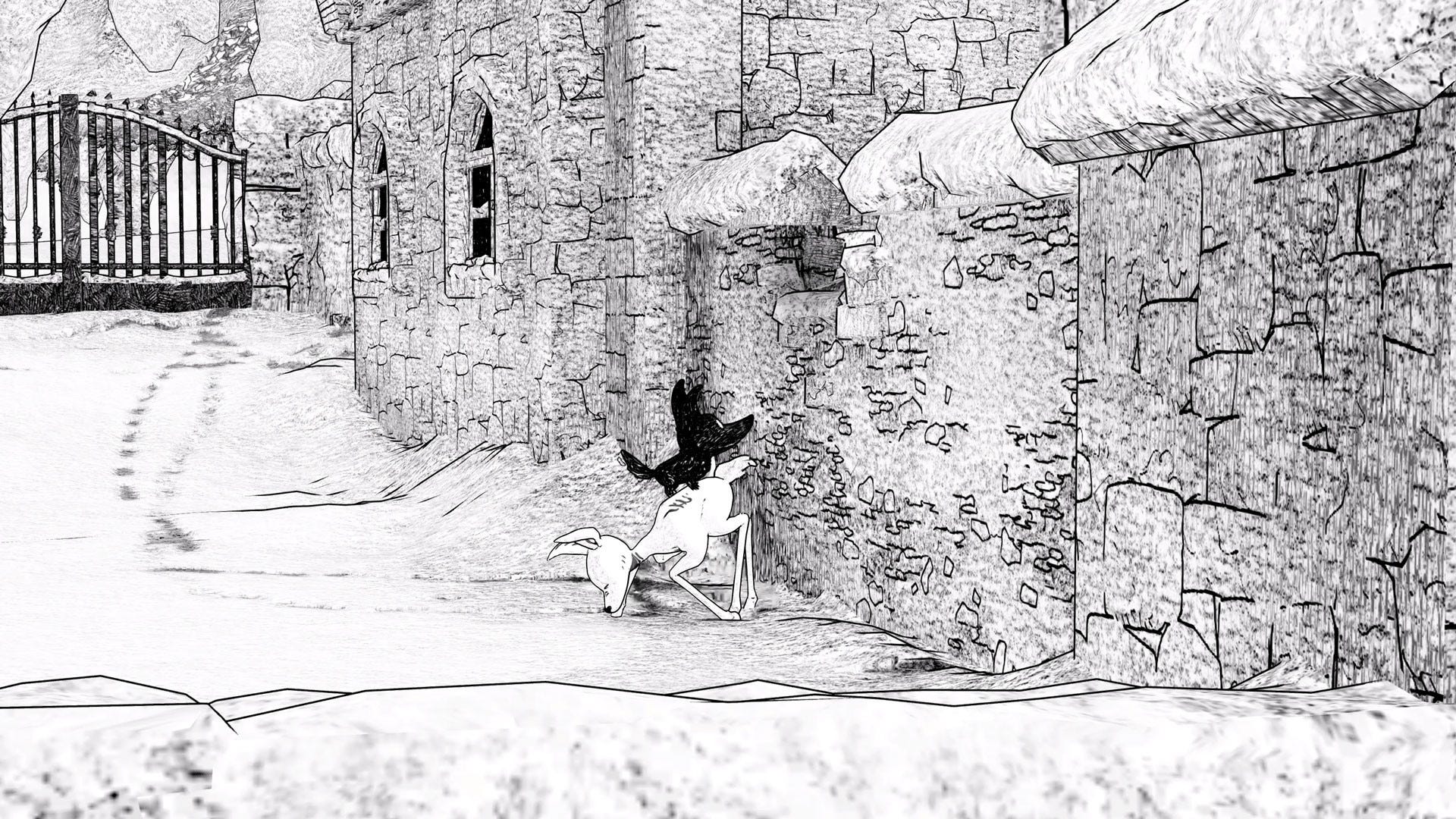
Take this beauty : Clair Obscur: Expedition 33 (or “thingamajig 33” if you're in the Land of the Rising Sun).
Observation is the key to success
There is a difference between looking and observing. Once you get past the stage of wonder (you know, that moment when the pixels dancing on the screen send your dopamine levels skyrocketing), it's time to start asking questions.
Let's take a look at how this game, made in France (oui oui omelette du fromage), uses colors.
Difference between the interface and the rest
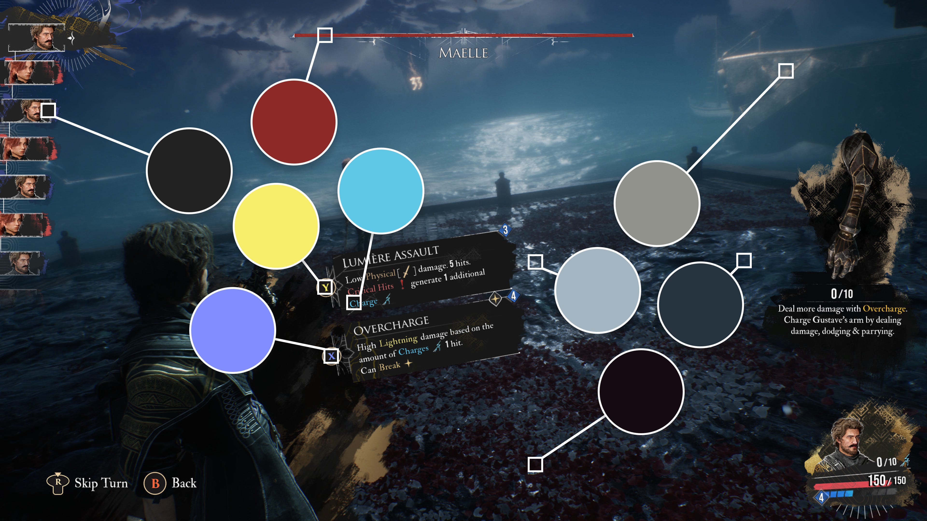
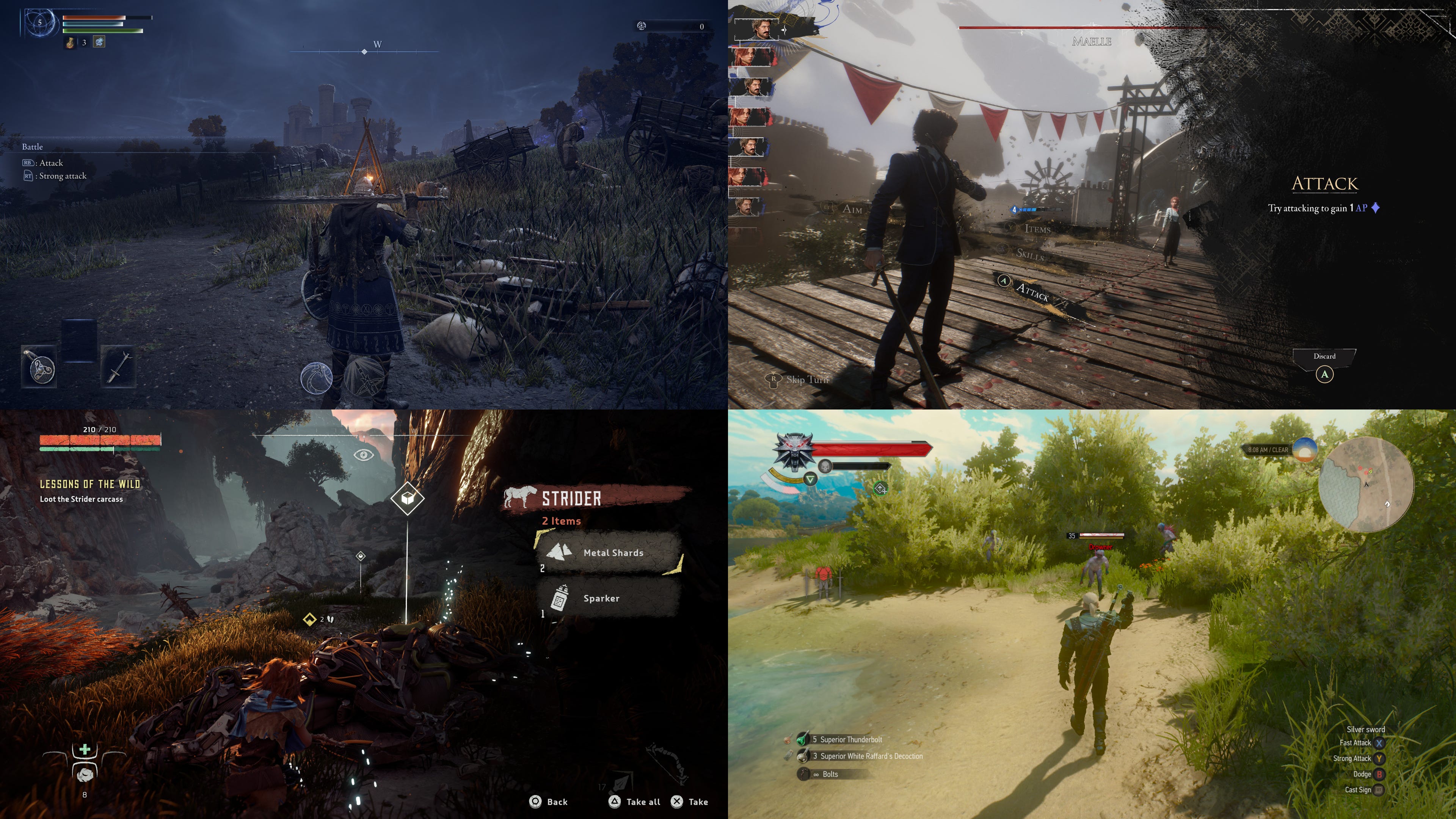
Here, there's no need to pull out your color picker and start copying everything. In the image above, which looks like a battle scene, we can clearly distinguish two things:
Firstly, the colors associated with the mood of the game, a rather dull combination of blue and gray that creates an unsettling atmosphere.
Secondly, the colors associated with the interfaces, a mix of very dark colors with touches of colors that are much brighter than the rest.
The first point shows us that choosing a palette color doesn't mean that all of them have to be on the screen all the time. In this incredible turn-based RPG, there are a multitude of environments, each with its own atmosphere and therefore its own color scheme.
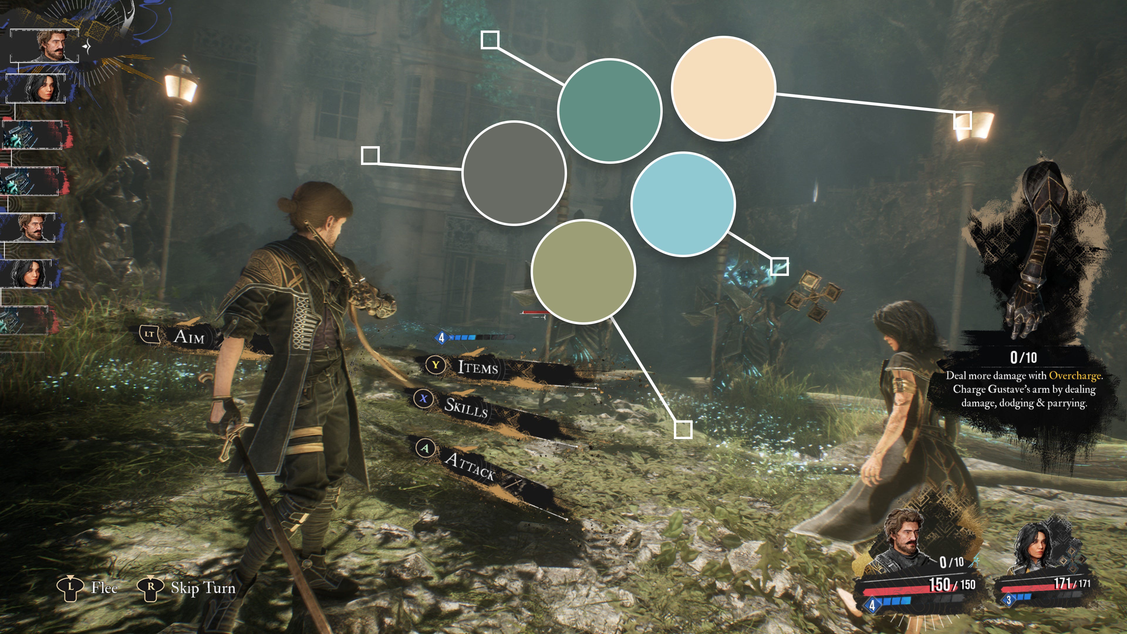
Too many colors at once can detract from the synergy on screen. Look how different this screen is from the first one in terms of colors, even though it's the same game.
Oh and while we are talking about Clair Obscur, take a moment to apperciate the work of Lorien Testard.
The second teaches us that contrasting and/or bright colors are everywhere in interfaces. Why? In the same way that movement can be used in a game: to attract attention.
This is why it's important to define the color palette with the game as a whole in mind, not just the setting or the interface.
I strongly encourage you to take your favorite games and do the same exercise, spending time analyzing which colors appear at what moments.
Working on your critical thinking skills is essential.
This little observation exercise allows us to project ourselves and try to understand the choices that were made.
However, before criticizing (in the sense of analyzing), let's keep in mind that we don't know the development context, the number of people involved, the target audience... These are all variables that you'll need to take into account for your own games.
Sharpening your critical thinking skills is an important factor when it comes to creating, and I'm not just talking about design. I'm also thinking about dialogue, gameplay, tutorials, controls, etc. Every choice you make will shape the final experience.
Choose a palette suited to the universe
It goes without saying that the atmosphere of a game also depends on the choice of colors, and to better understand this, we should first look at the psychology of colors.
This is a subject that is as fascinating (in my humble opinion) as it is vast, and there is still much to learn about it, but colors have real meaning for each of us and are rarely chosen at random in your favorite games.
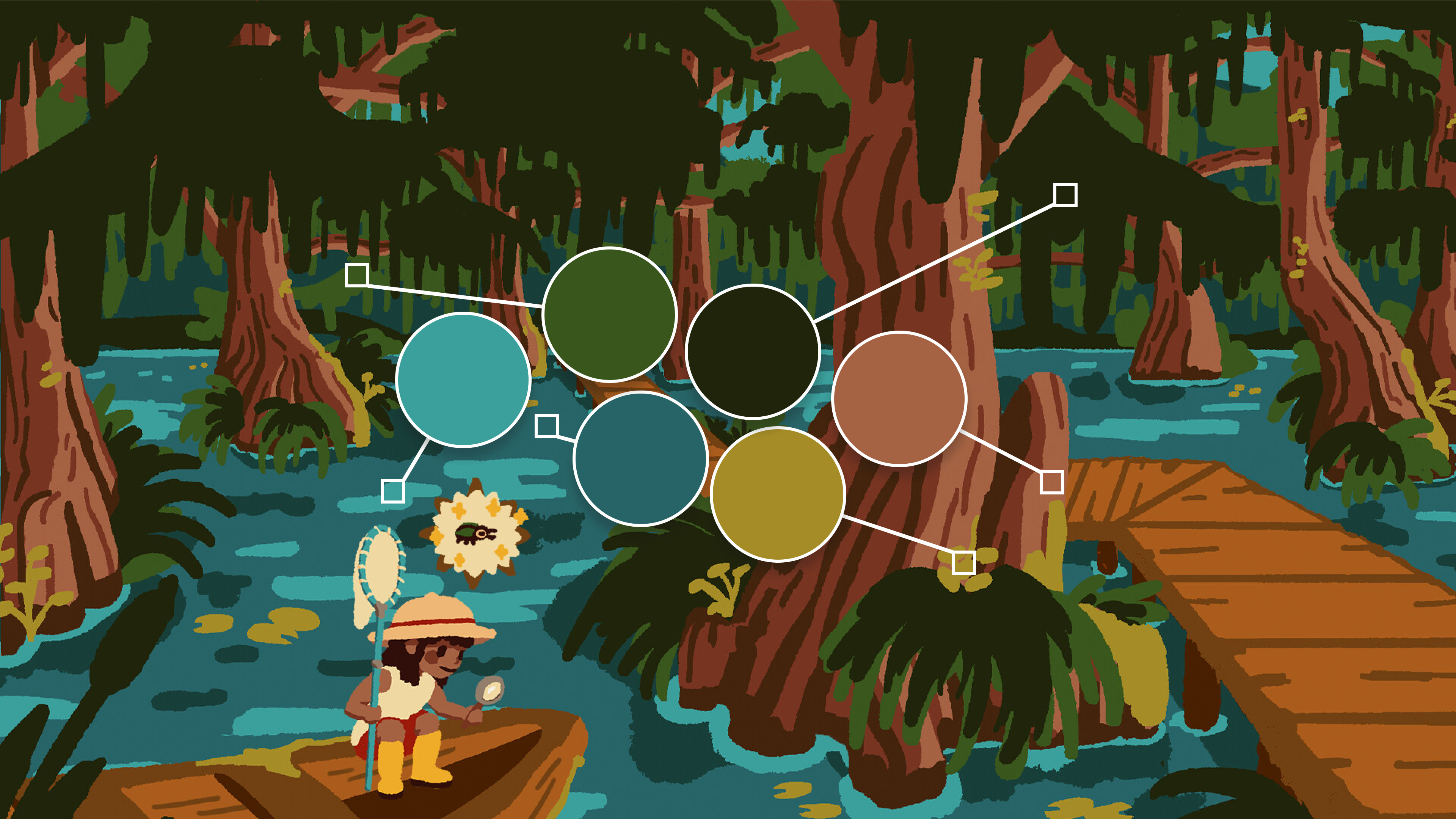
For example, by analyzing the colors of the game Kabuto Park, without even knowing its gameplay or what it's about, you'll quickly get some insights. These shades of blue, green, yellow, and brown, all quite contrasting, immediately bring to mind nature, the sky, and wood.
For a game whose pitch is “capture the cutest insects,” it's a perfect match.
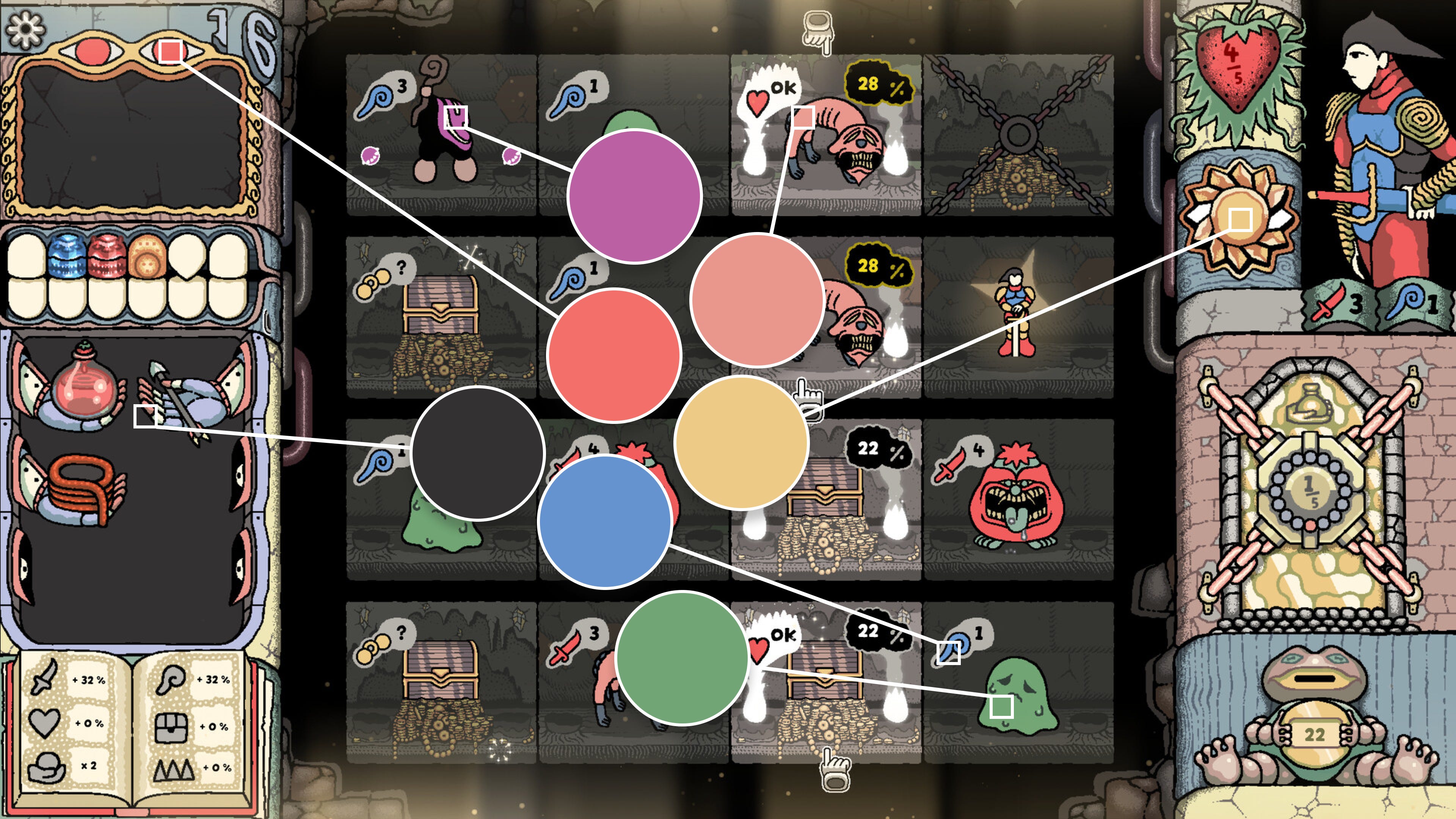
Let's quickly look at a second example with the game Sol Cesto. The palette here is much more varied, with more diverse tones and less striking contrasts.
Overall, the game is darker and yellow is very present. Coincidence? No. In Sol Cesto, your goal is to navigate the floors of a random underground labyrinth, descending deeper and deeper in an attempt to find the sun that was lost years ago.
Here we have another example of a palette that is well suited to the game's universe.
Each color comes with its own emotions
While yellow is more associated with optimism, blue is more associated with calm and consistency. You can find numerous studies on the internet, and we could debate the veracity of their findings for hours.
Let's assume that none of the rules mentioned in articles about color psychology are universal; each person will associate different emotions and feelings based on their own experiences or culture.
The color of a logo is never random
I love this image that attempts to categorize some of the world's most famous logos. However, aside from the date this image was created and the fact that some logos are no longer current, we should also consider that the meaning of colors can change over time.
Indeed, there is a lot of talk today about greenwashing, something that was less prevalent in the past, and I would be curious to see how many companies (not so green, unfortunately) end up with a logo in shades of green.

A different perspective depending on culture
Speaking of culture, I will give you a concrete example of how it can impact your designs.
In France, where I live, black is the color worn during mourning, while at weddings, the bride traditionally wears white.
Conversely, while researching online, I found that in Chinese culture, families generally wear white at funerals and the bride wears red at weddings (a color associated with happiness, success, and good fortune).
If this example is borrowed from real life, the same will be true in your game. If your game reaches a diverse audience, your color choices may not necessarily be understood in the right way on the other side of the globe. While this may be a marginal issue, it's still something to keep in mind.
Cultural differences in video games
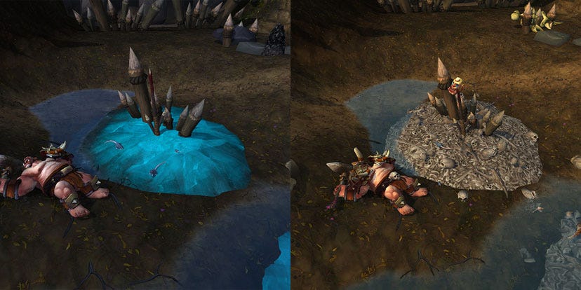
Here's a little anecdote related to culture in games: in World of Warcraft, which I'm sure you're all familiar with, there are some differences between the Western and Chinese versions.
In fact, blood and skeletons have an unfortunate tendency to disappear in the Chinese version. Allow me to quote JudgeHype, a news site about WoW.
What you need to know is that, contrary to what has long been believed, China does not ban blood or skeletons in video games. There are games in China that feature skeletons and are not censored in any way. They are not considered taboo in Chinese culture either. There are no laws banning the use of skeletons or blood.
However, Chinese laws and regulations are so open to interpretation that publishers modify their games in advance to ensure they pass the approval process. In other words, some of the skeletons in WoW could easily appear in the Chinese version of the MMO, but Blizzard prefers to rework the graphics rather than have the game refused release, which would have a much greater economic impact as it would delay the game's release in China.
And what about my palette?
Yes, let's get back to the matter at hand. The emotions conveyed by colors, as well as the culture of your players, help you choose colors more effectively, but these are not the only factors to consider.
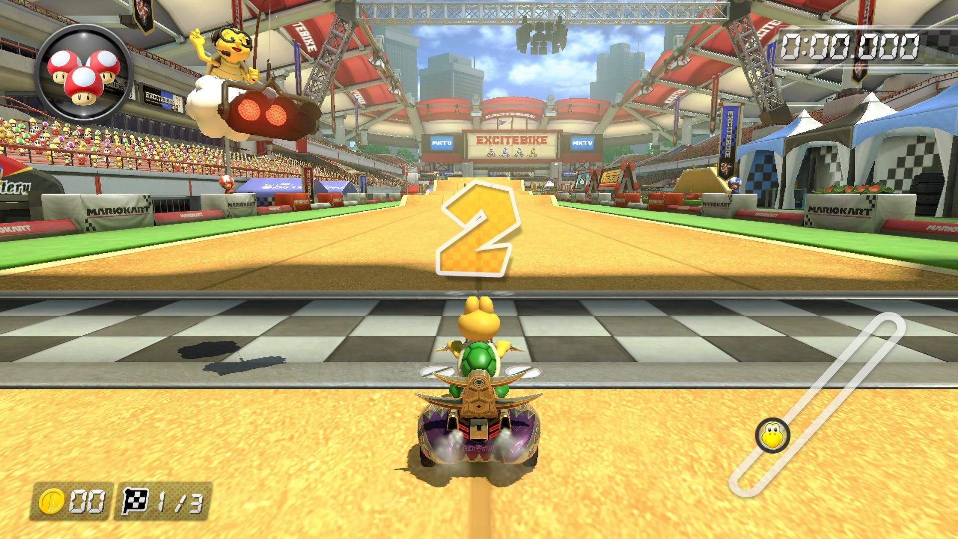
Mario Kart vs. Elden Ring: The Battle of Colors
For example, an arcade game aimed at the general public and casual gamers will have a more contrasting color palette with bright colors, such as the iconic Mario Kart below.
These games are generally designed for short, intense gaming sessions. Contrasting colors help maintain the player's energy and excitement.
In fact, this is exactly the type of tones and contrasts found in children's play areas, which are of course designed to attract the eye. Funny “coincidence,” isn't it?
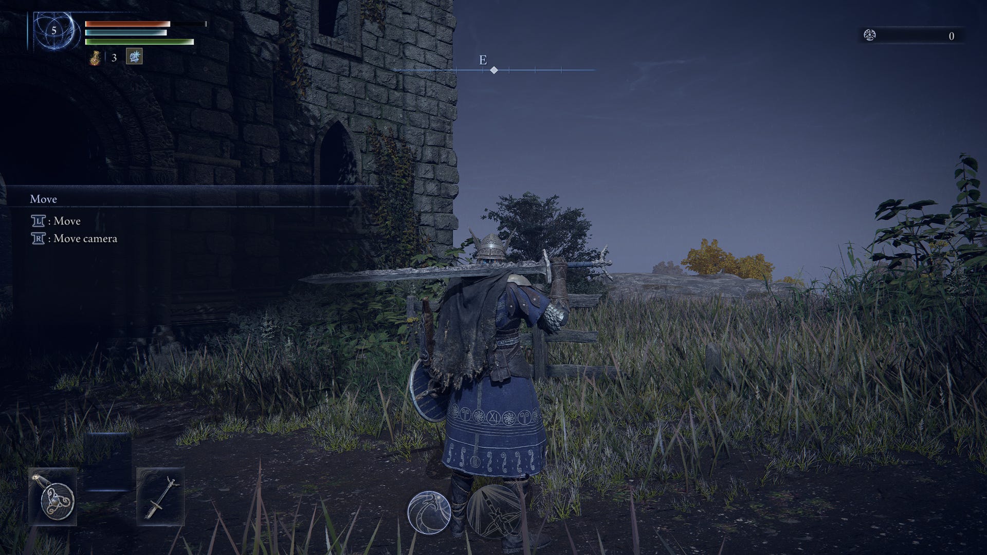
Meanwhile, a game like the latest Elden Ring Nightreign, which takes place in a medieval fantasy universe and has a difficulty curve considered high, uses rather dull and dark tones. This has several advantages:
The atmosphere is immediately more mysterious and the world seems more dangerous.
The game mechanics are more complex and require sustained attention. Less contrasting colors can help reduce visual fatigue during long gaming sessions.
This type of game encourages exploration and discovery. More nuanced colors can help highlight details in the world and guide the player to certain areas.
Consistent use of colors
When I write “consistent,” I mean “within the norm.” Take a look at the four games below. They're not necessarily from the same studio, nor are they necessarily aimed at the same audience or culture. And yet all of the health bars are red and positioned in the upper left corner of the screen.
Using patterns that are familiar to users is a significant advantage when creating your interfaces.
By reusing what your players already know, you greatly reduce the friction associated with learning time, and colors are of course to be included in this process.
Again, what I'm saying is just advice; it's perfectly acceptable to do things differently.
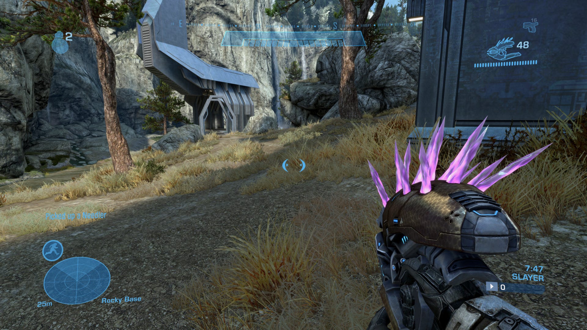
What about monochrome designs?
A monochrome design gives a clear and consistent identity, but it can also make the interface less engaging or too austere. It can be difficult to quickly distinguish between different types of elements. In this case, contrast and brightness are used to highlight certain elements.
The best example I have at hand is, of course, Halo.
By choosing a blue color combined with opacity, we get that futuristic feel that fits perfectly with the game's universe. However, as you can see, it can be difficult to distinguish the meaning of each element at first glance.
By losing color, or rather by keeping only one color, we also lose information.
It's up to you to test whether players respond well to your interface, because, as I mentioned, your judgment alone cannot ensure that the interface is understandable and/or accessible.
Focus on accessibility
You can't escape it: when I talk about colors, the subject of accessibility inevitably comes up.
Reminder about colors' best friend: color blindness
Color blindness, or color vision deficiency, is a genetic condition that affects the ability to distinguish certain colors. The most common types include difficulty distinguishing between red and green, as well as blue and yellow. This condition is more common in men (8% of the population) than in women (0.5%).
Implications for video games
Colorblind gamers may have difficulty distinguishing game elements that only rely on specific color codes.
Use high contrast and/or distinct patterns to help colorblind gamers.
Offer customization options for colorblind gamers, such as color filters or colorblind modes that adjust color palettes to make them more distinguishable.
Without these adjustments, colorblind gamers may have a frustrating or disadvantageous gaming experience, as they may miss crucial information presented only through color.
Personal experience with accessibility
A few days ago, I was working on the interface for Another Door and the possibility of changing the font to switch between pixel art / a conventional typeface / and one suitable for dyslexics. I took the opportunity to share this on the game's Discord channel and got an interesting question:

The answer is no. When we think about accessibility, we often imagine someone born with a different condition, or something that remains unchanged over time. I'm sorry to say that this way of thinking is wrong.
Accessibility is also for me, for you and for everyone
Accessibility can be useful at any time in your life. Let me give you a few examples:
Make the game playable with one hand? → If you have your hand in a cast or are holding your child at that moment.
Making the text more readable? → You want to play while enjoying the sun on your patio, but the visibility of your screen is not optimal.
Making the game display subtitles? → Not just for the hearing impaired, but imagine if you have someone sleeping in the next room.
These are just a few examples from everyday life that are directly related to accessibility in games. While some choices are personal (such as the preference between pixel art and high-resolution fonts), others will allow more players to enjoy your game in the best possible conditions.
My reasoning, if I had to sum it up, is to treat others as you would like them to treat you. This applies both in everyday life and in the options you offer in your games.
Conclusion
As usual, this is just a tiny fraction of everything that could be said about colors in video games. Color psychology, as well as your players' experiences and culture, greatly affect how your design choices are perceived and, therefore, how your game is perceived.
Contrast, game type, and accessibility are all factors to consider when choosing a palette. Your greatest allies will be your critical thinking and observation skills. Spending time analyzing how other games work will likely give you more insight than you think.
Another Door showcase & Private playtest
It's been a while since I last wrote an article, and the reason is pretty simple: between Indie Game Lyon, a trade show where we presented Another Door, and the launch of our private playtest on Discord, the time I had to write was, let's say, rather limited.
As for the trade show, everything went well. We had about a hundred players, a few dozen wishlists, and a lot of feedback, which is incredibly valuable to us.
Then we opened the game to private playtesting via the features available on Steam (key distribution and online matchmaking). And let me tell you, we didn't expect so much work after that.
The amount of feedback, bugs, and ideas for improving the game that we've collected is huge, and that's great! Because that's exactly what we were looking for when we launched this playtest.
Add to that our search for a publisher and the fact that I've started teaching UI Design to future game designers, and you can imagine that time is flying by right now.
Links worth visiting
Cocorico - here are two French indie games, Sol Cesto & Kabuto Park, released very recently. Take a look!
Game Accessibility Guidelines - A straightforward reference for inclusive game design.
Bevy Engine - A refreshingly simple data-driven game engine built in Rust
Free and Open Source Forever!A modern 2D level editor - from the director of Dead Cells.
The GMTK Game Jam - is an annual game making marathon, where individuals and teams try to make a game that fits a theme, in a super short time period.
Chroma - (developed by Ubisoft) is a one-stop solution for detecting color blindness-related issues in games.
Jaku - is an exploration and search experience with procedural levels, making its replayability endless.
The complete guide - for creating VFX within League Of Legends.
Polyglot Gamedev - Start localizing your game, using this human translated resource for the basics.
RetroArch - is the reference frontend for the libretro API.